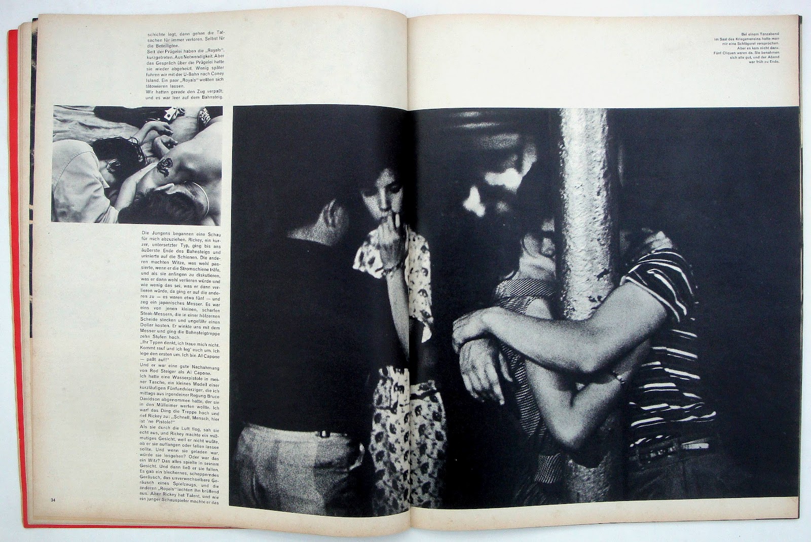
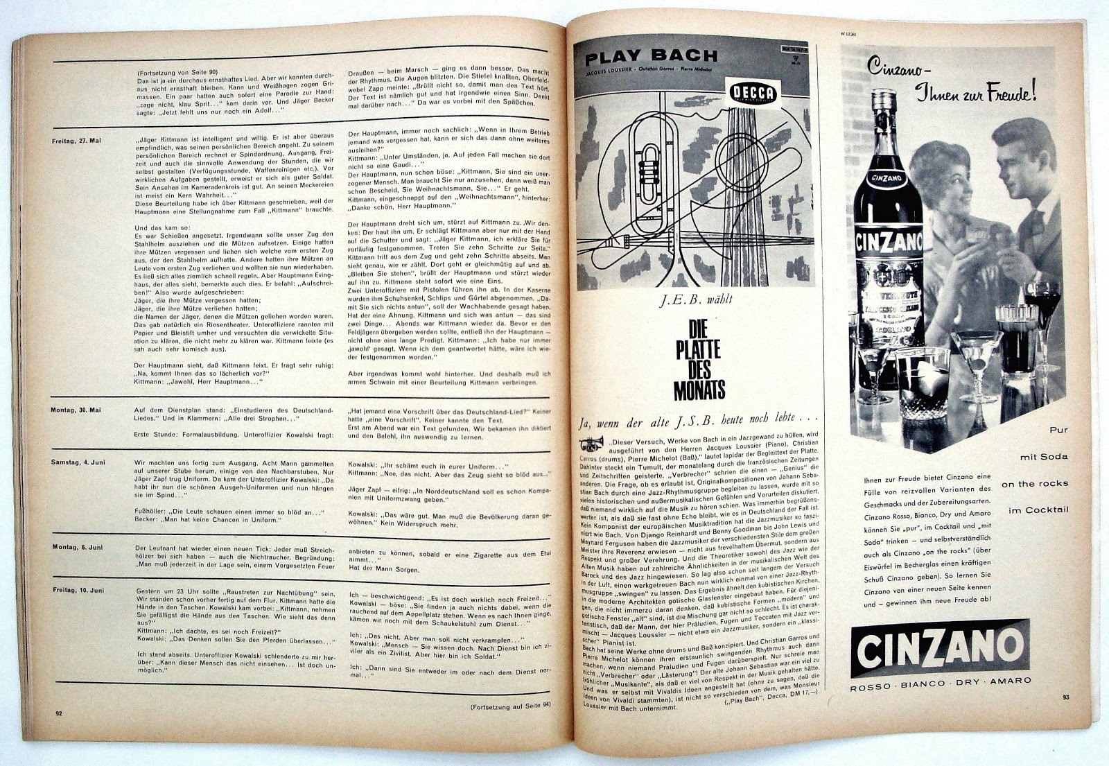
Ask any designers (even retired ones like me) who were around in the sixties to name five well-designed and influential magazines and I bet twen keeps popping up. The first issue I bought was number nine from October 1960 and I was hooked. There was nothing else like it thanks to the way Art Editor (and Editor) Willy Fleckhaus used photos, illustrations and white space.
It was the treatment of the black and white photos that made twen standout. As big on the page as possible especially if they had a lot of black. Spreads would have one huge photo a much smaller one and some text with a dollop of white space, simplicity worked and nothing was to detract from the images. Color was introduced in the early sixties but twen remained essentially a mono magazine. A large page size helped: just over 13 by 10.5 inches.
The first issue was undated but I think it was April 1959, this was followed by bi-monthly issues and monthly in 1962. All the covers were black, unusual in itself for a consumer title, with a photo of a pretty female twenty-something. Actually, the last five covers were white with a black logo, the final issue was June 1971. The issue below was one of two with just type on the cover.
Another unique feature was the headline use of Schmalfette Grotesk (left) a beautiful condensed sans designed by Walter Hattenschweiler in 1954. Fleckhaus used it in all sorts of permutations and sizes, always with tight spacing and caps only.
The issue below is complete except for a few pages that had text and ads but for future posts, I'll just show what I think are the most interesting spreads from each issue.
 |
Eagle-eyed typographers will notice different lower case 'e's on the cover.
A bit of Helvetica Medium mixed with Standard Medium. |


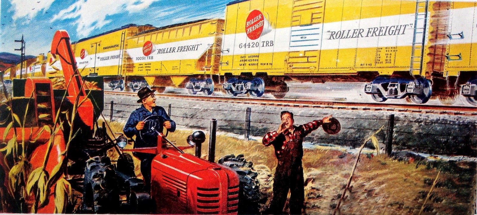


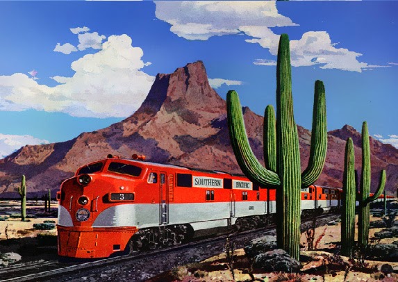


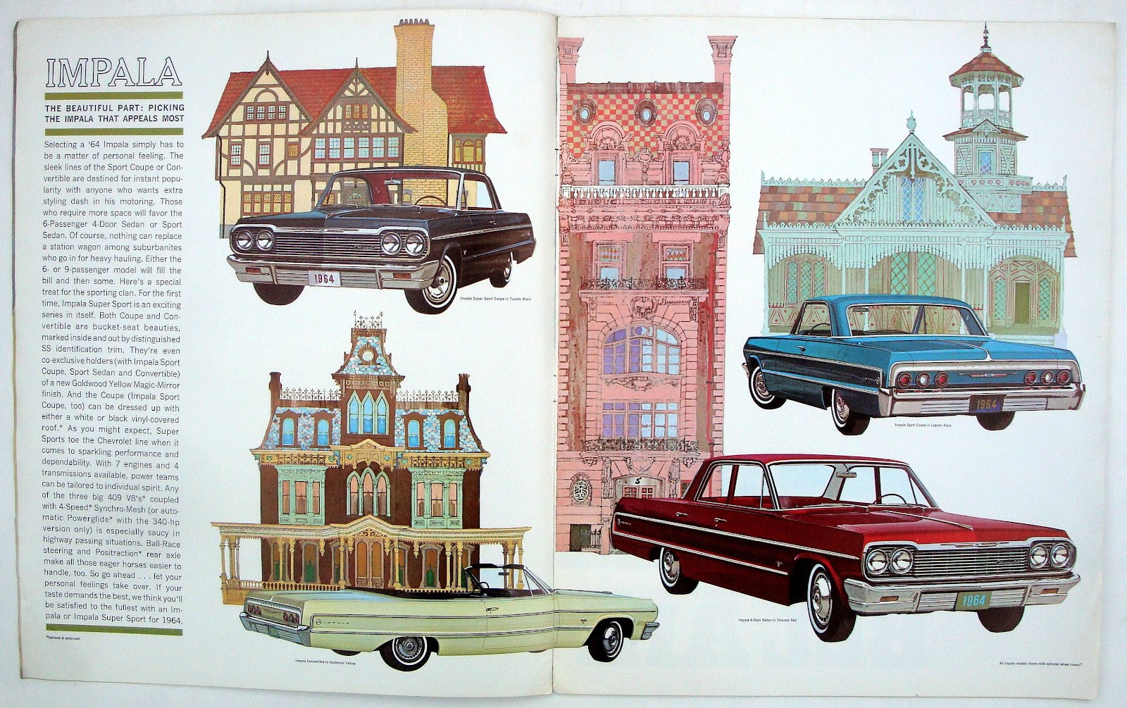
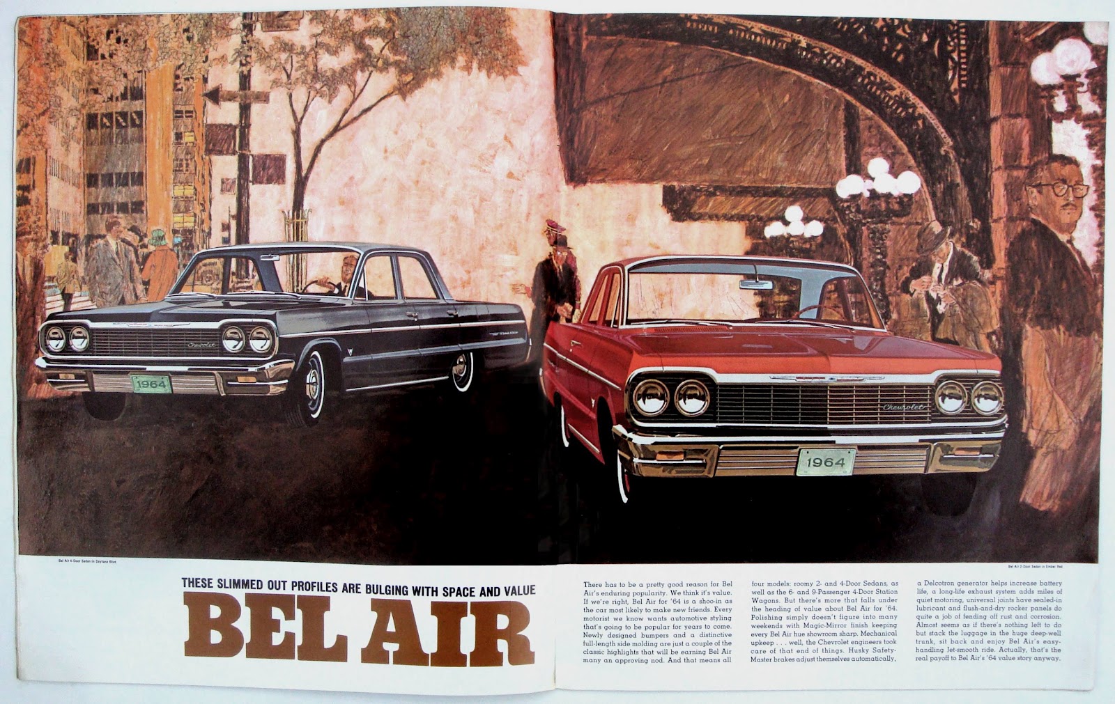
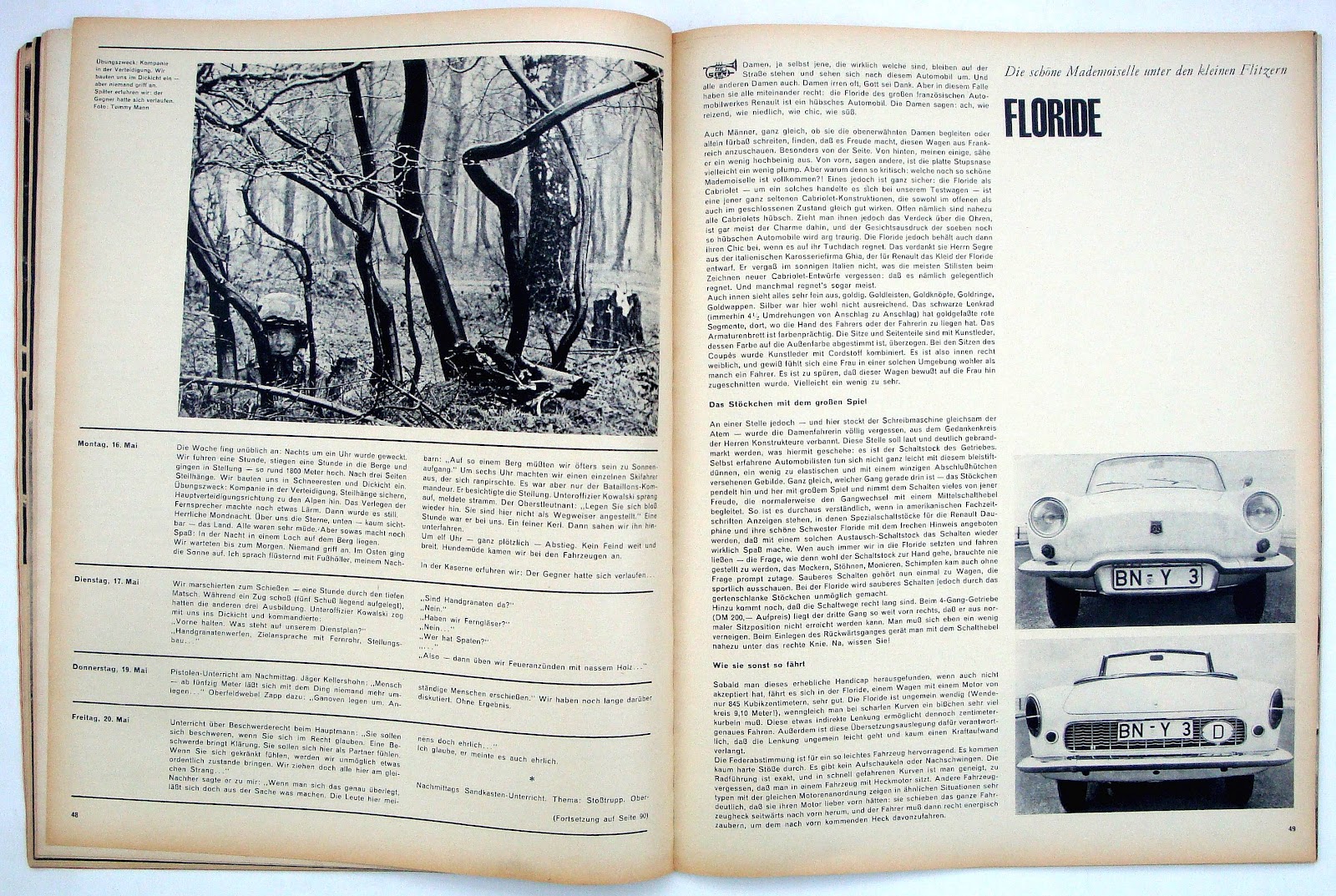
 Typical car brochure from Chevrolet in the sixties and to try something slightly different the pages were presented in a magazine format. The Belair spread could have been a fiction feature from the Saturday Evening Post, McCall’s or Redbook. Of course it wasn’t designed by any publication designer because all the text is shown as one paragraph. The last spread with the tech details is a fun read though.