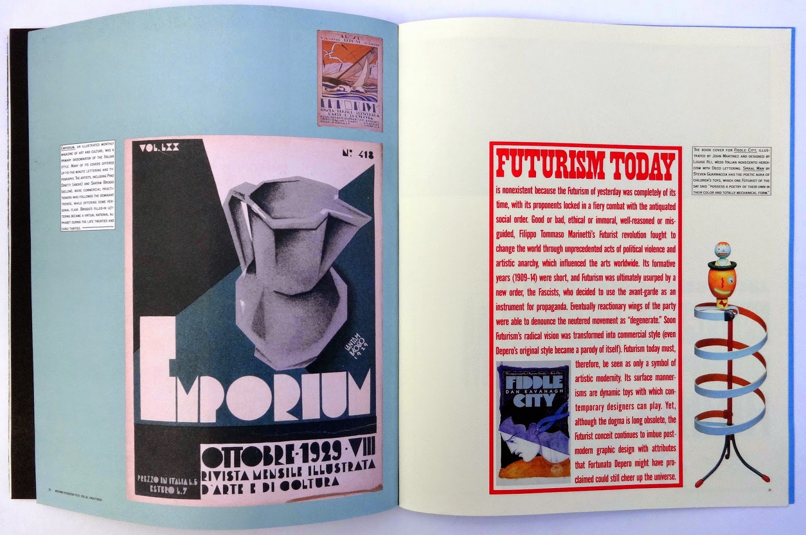
The result were twenty-six letters printed on loose seven inch square paper. This came in a black fold-out box with a six page leaflet about National (the company closed in 1987) and the last sheet had the names of each designer and the typeface.
Oddly there was no reference to the different papers used, a cover stock in different colors, or the printing techniques; the B is embossed and debossed; the H uses gold ink; the I was printed with a white square then a black overprint. Some letters were silk screened, the Y used red foil blocking and I think some letters used Dayglo inks.
I believe it was created in the seventies or early eighties and I kept it because the students work has a sort of simplicity and sense of fun that a professionally produced bit of promotion couldn't really capture.